Google Lens may be getting a new, camera-like icon in a future update.
According to Android Police, the new icon is likely part of an a/b test. A tipster shared a picture of the new icon as spotted in the search bar of the Google app, but Android Police wasn’t able to replicate it. Likewise, MobileSyrup has checked several Android phones and none sport the new design.
![]()
Top: new Google Lens icon. Bottom: old Google Lens icon.
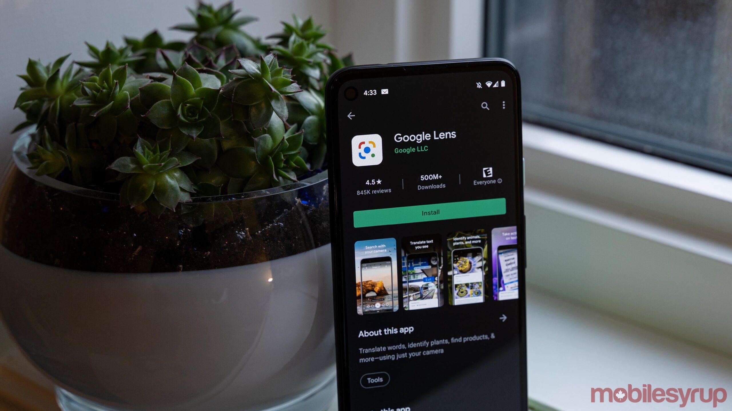
The Play Store still shows Google Lens with the most recent redesign, which dropped back in May 2019. The only real change is the shape of the symbol — the current icon features the classic Google colours in the shape of a square with rounded corners and a blue circle in the middle that represents a camera lens.
However, the new design is just the shape of a camera with Google colours and a blue circle to be the lens.
While the change may indicate people found the current icon confusing, I imagine people will also find the new icon confusing — to me, it looks more like an icon for a camera app than for Lens.
Considering this is likely a test, we may never see the new Lens icon roll out. Android Police suggests Google will want to see if it increases Lens usage and make a decision based on that. Alternatively, it’s possible this redesign is meant to bring the Lens icon in line with Google’s recent slate of icon redesigns, although the current Lens icon also fits well into the multi-colour square outlines with subtle differences to differentiate between apps.
Source: Android Police
