
About |
End the tyranny of cable!
Google just perfected the streaming TV menu. Too bad most devices won’t get it.
Jared Newman / IDG 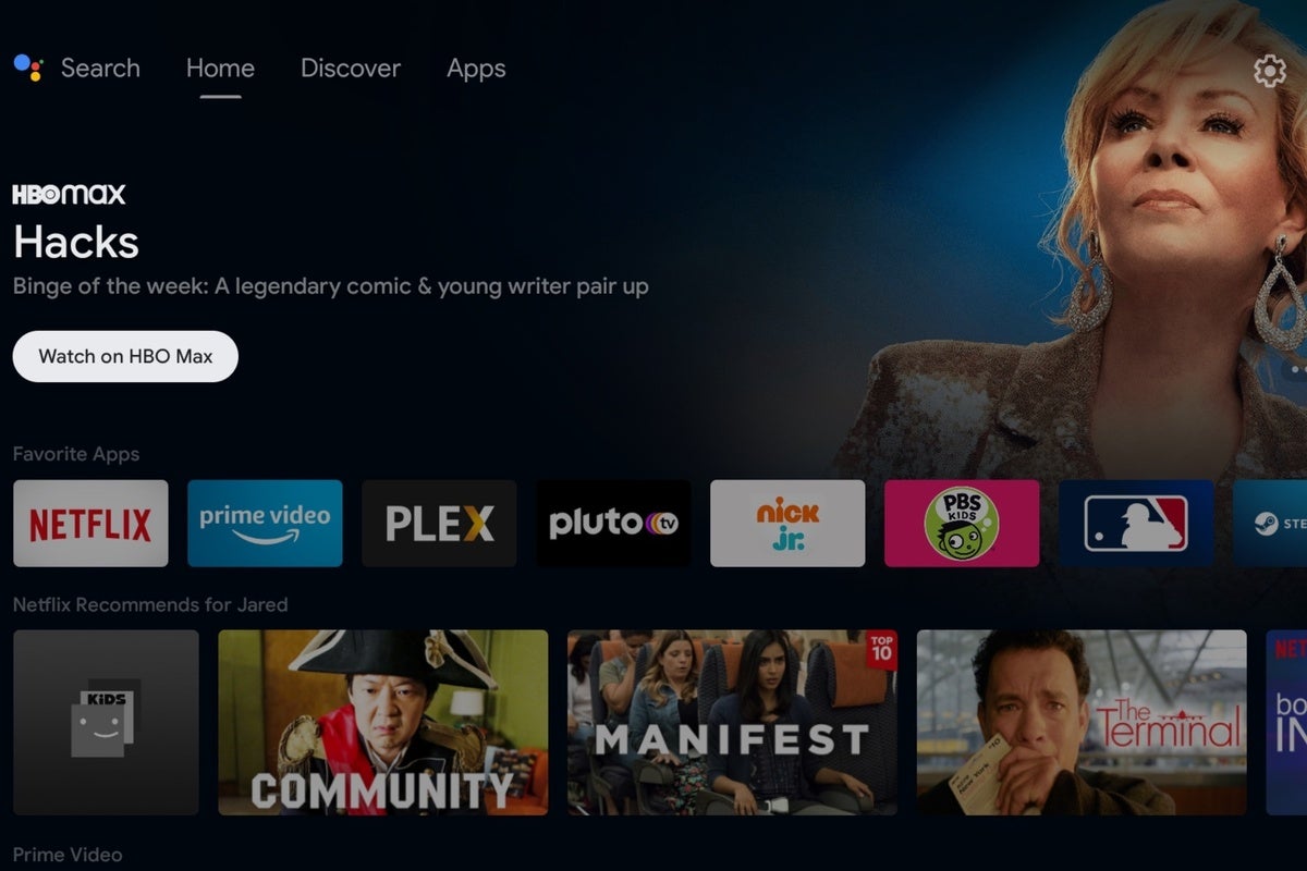
Today’s Best Tech Deals
Picked by TechHive’s Editors
Top Deals On Great Products
Picked by Techconnect’s Editors
After years of waiting, I’ve landed on the the ideal menu system for streaming, one that helps you find new things to watch without overcomplicating the basic task of launching apps. And it’s landed in the unlikeliest of places: the Nvidia Shield TV, a $150-and-up streaming player that runs on Google’s Android TV platform and mainly appeals to tech enthusiasts.
Earlier this month, the Shield TV received a new interface that makes all your streaming apps much easier to access, while also adding helpful recommendations on what to watch. It’s smarter than other streaming platforms like Roku and Fire TV, and it has some big advantages over the similar looking—but in many ways different—interface on the Chromecast with Google TV.
Now for the bad news: I’m not sure Google is even aware of its own accomplishment. While Google has made the new interface available on the Shield TV and some other existing Android TV devices, it’s pushing the separate Google TV interface on newer streaming players and smart TVs. That means the Shield’s menu system is unlikely to appear on any new products going forward.
Apps and content combined
The old Shield TV interface consisted of a single home screen, with a row of your favorite apps at the top and several rows of “channels” underneath. Each of those rows represented a different app, which could highlight recommendations or recently watched videos, and users could hide or reposition those rows as they pleased.
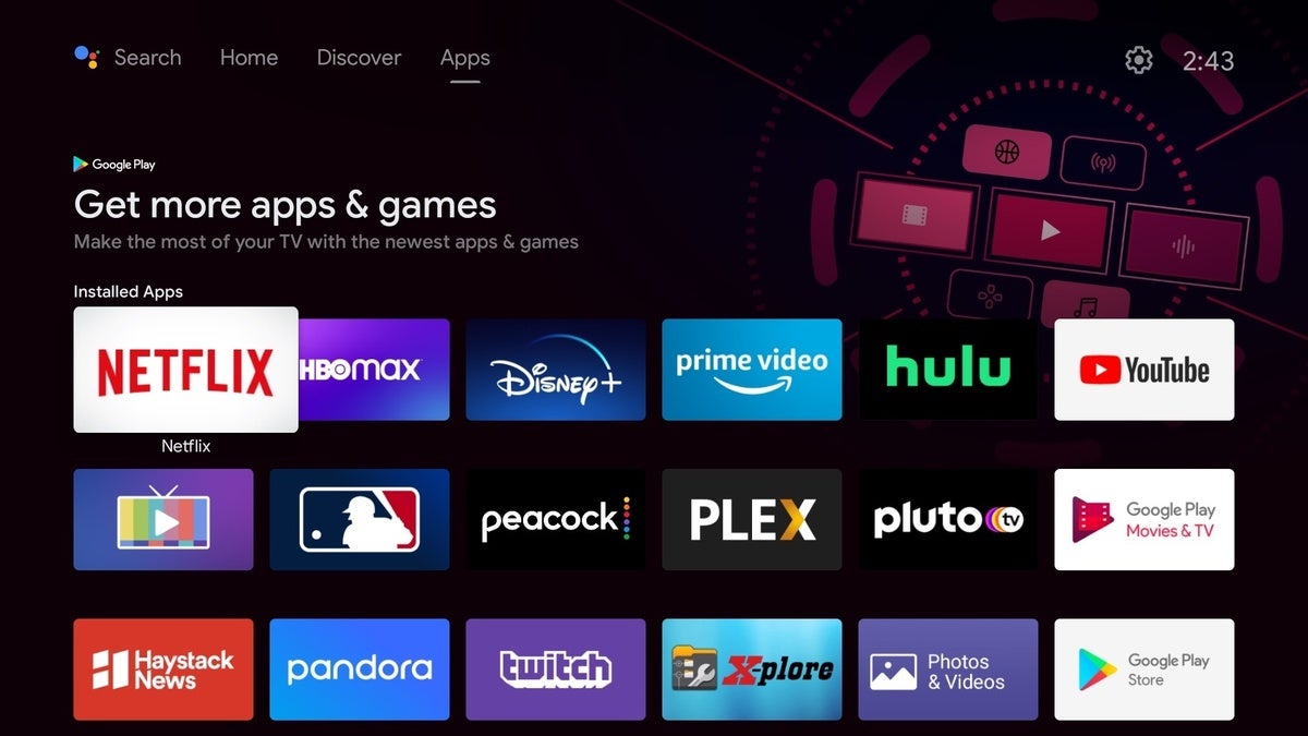
That basic concept hasn’t gone away, and it’s still a nice way to glance at some top picks from your favorite apps, but now Google has added a couple new tabs to the Home Screen as well. The “Apps” tab provides a big grid for all the apps you’ve installed, replacing the old system of having to scroll and click on a little red “apps” icon. (Under that system, your apps also appeared in a narrow overlay that was harder to navigate.)
 Jared Newman / IDG
The Apps tab lets you see all installed apps without any hidden menus or clumsy remote control shortcuts.
Meanwhile, the “Discover” tab suggests even more movies and shows to watch, grouped by categories such as “Comedies,” “Oscar-winning movies,” and “Trending on Google.” These recommendations come from across different apps, including Disney+, Amazon Prime, Hulu, and HBO Max, so you don’t have to jump into each one to see what’s on.
 Jared Newman / IDG
The Discover menu lets you browse streaming service catalogs in one place.
To me, this one-two punch represents the platonic ideal for how streaming menus should work: Make it easy to get recommendations, but not at the expense of a simple and easily accessible app launcher.
Other streaming platforms haven’t quite figured that out yet.
The Apple TV 4K comes close. Its “TV” guide app is a helpful way to see what’s streaming, and from there you can click the home button for your full app list. Still, I find that double-click mechanism to be too clumsy, and while you can always reassign the remote’s home button to go straight to your app list, that in turn makes the TV app harder to reach. Apple really ought to streamline this all into one menu, like Google is doing.
Amazon’s Fire TV devices, meanwhile, stray a bit further from the mark. The Fire TV’s newly updated interface only lets you pin six favorite apps to the Home Screen, with the rest hiding behind a secondary menu. Underneath, you’ll find row after row of recommendations with no real sense of organization. While Amazon still has some smart ideas—like the ability to filter shows from your subscriptions—the whole system still feels too chaotic on the whole.
As for Roku, its home screen makes no attempt to serve up recommendations outside of its “Featured Free” section, which only covers ad-supported streaming services. Roku’s focus on the app grid is part of what makes it so simple to use, but it’s a little too simple for my liking. The Shield TV’s interface offers the best of both worlds.
Now, I should note that not everyone’s thrilled with the new Shield TV interface. As 9to5Google reports, some users are incensed by the new promotional carousel at the top of the screen, likening it to a form of intrusive advertising and even review-bombing the home screen’s Google Play Store listing in protest.
I’m not too bothered by it myself. The carousel doesn’t really impede navigation like the mid-menu ads on Fire TV, and it doesn’t reduce the available screen space for apps, like the banner ads on Roku players. If anything, the large teaser art gives the Shield TV’s Home Screen a more modern look, in line with other streaming platforms and apps.
Android TV vs. Google TV
Sadly, there’s a strong chance you’ll never get to use this new menu system, because it’s only available on the Shield TV and a small number of other devices, such as smart televisions running Google’s Android TV operating system.
For new Android TV devices, Google has indicated that it’s pushing a different interface that it calls “Google TV,” as seen on the Chromecast with Google TV streaming dongle. While the underlying operating system is the same, the menu system has some key differences.
 Jared Newman / IDG
The separate Google TV interface, as seen on the new Chromecast, has some unique features like Watchlist support.
Accessing your master app list, for instance, is more of an ordeal on Google TV. To reach it, you must scroll all the way to the end of your favorite apps row, then select “See All” to bring up a separate menu. Google TV also puts it recommendations front-and-center on your home screen, omitting Android TV’s channel row concept entirely. That means you can’t get any original content recommendations from Netflix or any other app that isn’t fully integrated with the new Google TV system.
The Google TV interface does have its own advantages. It lets you save movies and shows to a watchlist from any device, for instance, and it has a “Live” menu that lets you browse the channel guides of either YouTube TV or Sling TV straight from the home screen.
And yet, I prefer the Shield TV interface for the way it executes on the basics. It still provides recommendations from across different apps, but it makes those individual apps easier to reach when you already know what you want. Other streaming platforms should take note of how well it works. And, perhaps, so should Google.
Sign up for Jared’s Cord Cutter Weekly newsletter to get this column and other cord-cutting news, insights, and deals delivered to your inbox.
Note: When you purchase something after clicking links in our articles, we may earn a small commission. Read our affiliate link policy for more details.
Jared Newman covers personal technology from his remote Cincinnati outpost. He also publishes two newsletters, Advisorator for tech advice and Cord Cutter Weekly for help with ditching cable or satellite TV.