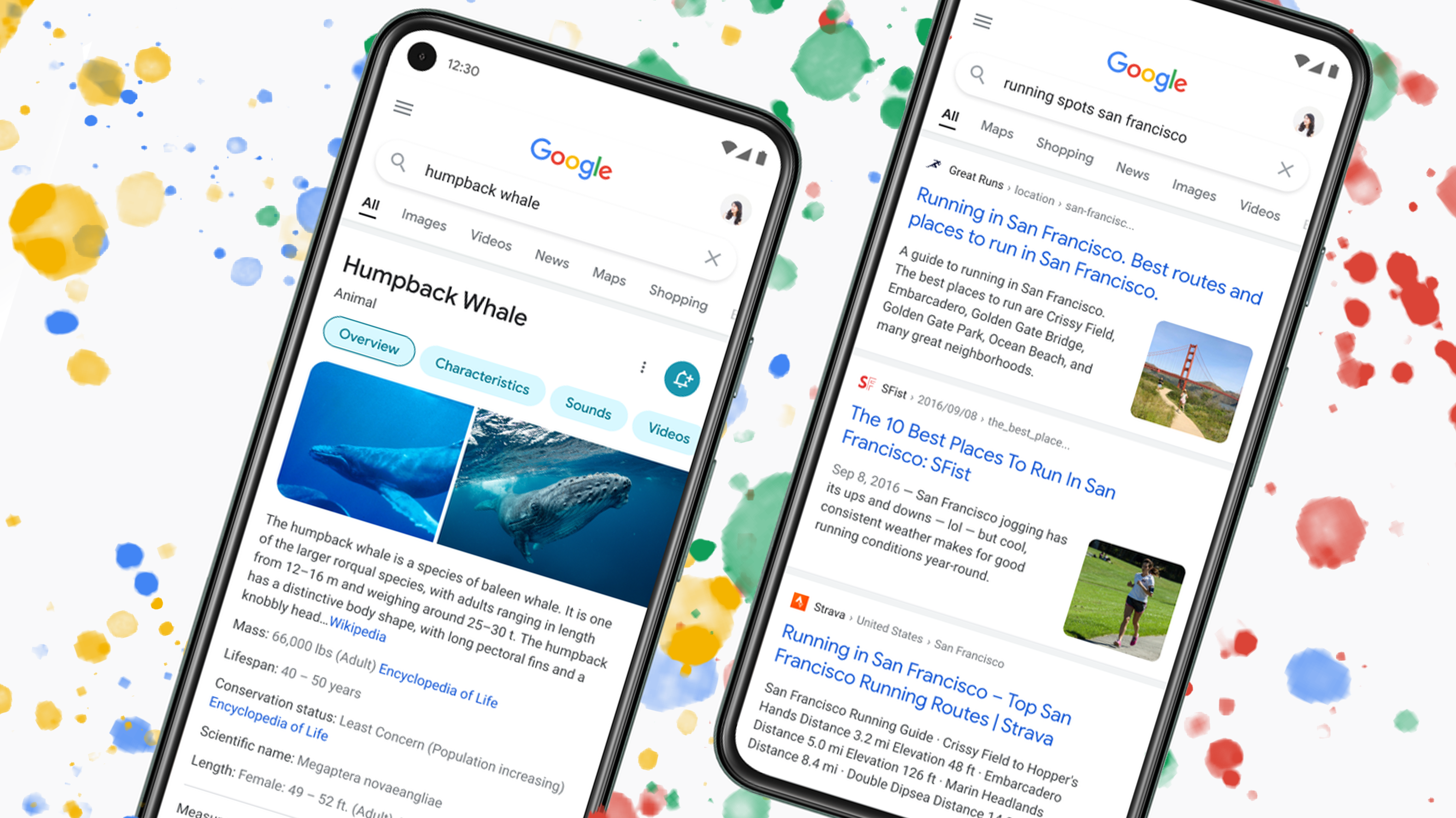
This design brings Search more in line with Google’s other Material Designed apps

Google is beefing up the design of its search results on mobile phones with some pops of colour to help make it easier to find what you’re looking for.
The main change might go unnoticed by most people since Google has simply decided to make the text a bit bolder while making titles larger, so it’s easier for people to see at a glance.
Behind the text, the digital cards that each Search result sits on top of now stretch to the edges of the screen. This is a minimal change, but it does take away some of the visual clutter, pushing focus back onto the Search headlines.
Google’s pre-made Search cards that display pertinent info that’s usually stripped from Wikipedia are getting a slight refresh as well. Instead of a colourful bar housing all the different pages of the Search Card, each page’s button is now coloured. This helps the buttons stand out a bit more while still accomplishing the minimal look that’s at the heart of this redesign.
This isn’t a crazy overhaul. However, it brings the look and feel of Google Search more in line with Google’s other apps and services, which is always nice to see.
Google doesn’t mention in its blog post that ads have also gotten a new look in this update. For instance, when I searched for Humpback Whale, instead of looking at a super clean page like the screenshots Google shared, I was instead greeted with a giant ad for whale things.
Specifically, the ads from Google Shopping now seem to take up more space at the top of your search results.
Source: GoogleÂ

