Abbie somebody —The US’s expected weather is based on a 30-year average, updated once a decade.

On Tuesday, the National Oceanic and Atmospheric Administration (NOAA) released a set of data it terms the “US Climate Normals.” Updated once a decade, the figures contained in the report are based on the past 30 years of weather records, and they provide a sense of what the typical weather is on a given day of the year in each of the US’s states and territories.
As you might imagine given the recent global temperature records, these figures show widespread warming compared to the normals of even a decade ago. They also reveal that while much of the US is getting wetter with the changing climate, California and the Southwest are in the midst of a dramatic drying trend.
What’s normal, anyway?
As NOAA puts it, you’re most likely to come across its climate normals on a weather forecast when the projected conditions are compared to the ones typical for that location and time of year. The normals provide information on what’s typical.
The normals cover a period of 30 years because that is typically viewed as a short enough time frame that climate trends won’t have a dramatic influence. And the normals are calculated once per decade because the US is required to release them as part of its membership in the World Meteorological Organization.
Figuring out what number to use is more complicated than it might seem at first. Regional information is provided by a national network of weather stations. But these stations occasionally move or experience periods of downtime. NOAA researchers also perform quality checks to ensure that the data available for each station meets quality standards and isn’t contaminated by hardware or software errors.
From this data, researchers derive a large series of measures beyond the typical daily temperatures and frequency of precipitation. These measures include the frequency at which the precipitation fell as snow and the frost and freeze dates of the winter. Other measures include heating and cooling days, which are critical for understanding the patterns of energy use in the US. Growing days are calculated for agricultural analyses.
This year sees NOAA introducing a couple of new measures that will be made part of future analyses. These measures will include a gridded map of the continental US with a 5 km resolution, providing fine-grained details of the normals in specific areas. The map will also include normals adjusted for the El Niño/Southern Oscillation, which has a dramatic effect on US weather but varies chaotically over the decades.
What’s new?
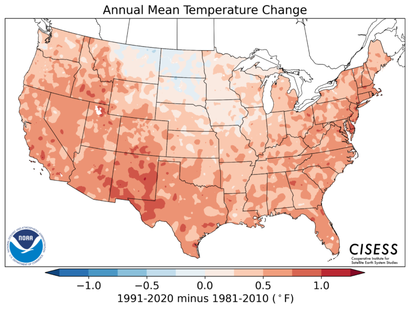
Naturally, NOAA compares the normals for this most recent period (1991-2020) to both the previous—and partly overlapping—period (1981-2010) and to over a century of previous normals. For all but a small portion of the northern Great Plains, the warming over the last decade has been large enough that the new normals are hotter than the previous ones.
The most recent normals for precipitation, as compared to those of the 30-year period ending in 2010. The precipitation trends of all of NOAA’s normals compared to the average precipitation from 1901-2000. The temperature trends of all of NOAA’s normals compared to the average temperature from 1901-2000.
Precipitation-wise, there’s a sharp regional divide. Continuing a long-standing trend, the entire Northeast saw precipitation levels increase over the previous normal. In the past decade, increased precipitation was also the trend in the Southeast, Midwest, and the northern Great Plains, most dramatically in an area very similar to one that had cooled since the last normals. This area stretched from West Texas north to Colorado and westward from there to the coast. In contrast, the Southwest and California saw considerably less rainfall over the past decade.
Compared to the 20th-century average, the pattern becomes considerably more complicated. The Southwest has been drier than average for a period that includes the normals ending in 1950 to 1980. That drying period was offset by wetter periods before and after. The extended wet conditions in the Northeast and Midwest get off to a weak start in the normals ending in 1990 but have persisted and strengthened since. Conditions elsewhere have varied over this time period.
For temperatures, the US as a whole followed the global trends, with most areas of the country warming early in the century before idling until the 1980s. In the normals ending in 1990, warming became clear in the western half of the country, and by the end of the century, warming had spread to everywhere but the Deep South. In the most recent set of normals, the entire country is warmer than the previous century’s average.
Overall, the release of the new normals doesn’t tell us anything we couldn’t have figured out by following climate trends. But the new normals are still going to be extremely useful because of additional NOAA analyses, which can be fed into models that project the changing needs for things like air conditioning, flood protection, and irrigation.
By John Timmer

